Optimize your Landing Page
The creation, organization and refining of landing pages is the key to pay per click marketing and online lead generation. Landing pages are audience specific, and an automotive site landing page that converts 10% of users cannot be copied to a campaign selling insurance.
Users respond differently based on the time of day, offer, price point, demographic, education level, style preferences and past experience with your brand. Thankfully we can test and design for most of these variables.
Your landing page, or squeeze page is useless if the visitor can’t immediately find what they are looking for, and take appropriate action. The page needs to be scannable, use visual elements and be well organized.
There are several essential elements that make up a successful and effective landing page and increase your conversion rate.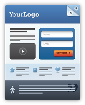
Simplicity
The visitor must be able to understand the content of the page in less than 10 seconds, preferably 5. The longer s/he must try to comprehend your offer, the less likely they are to complete it. Your landing/squeeze page needs to be appealing to your visitors without distracting them from the goal.
Legibility
The text should be easy to read and the correct size for your audience. Text should be broken up and use lists. Some people prefer long sales pages, others prefer graphics and minimal text. Test this on your products to see which one works best for you.
Contrast
Create high contrast between background and text because to increase legibility, but be mindful of flashy backgrounds. A landing page is not a banner ad. It is a focused message encapsulated in a single page.
Links
Most landing pages have no navigation, and no extraneous links on the page. This gives the visitor only 2 options: complete your action or click the back button. You have a 50% chance of success.


